A visual reference to SwiftUI DatePicker styling for iOS and macOS

Each section below provides a snippet of code that configures a particular DatePicker, followed by the UI component created by iOS and macOS output for the specific component configuration.
-- Some SwiftUI styles are not available on both iOS and macOS. For example the Wheel style is iOS only; the Stepper style is macOS only. When this applies, it's called out.
-- UI Appearances below were captured on iOS 14.4 and macOS 11.1. iOS 13 do vary, and both platforms may vary in future releases.
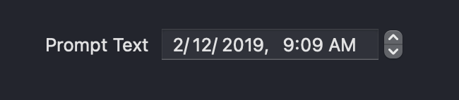
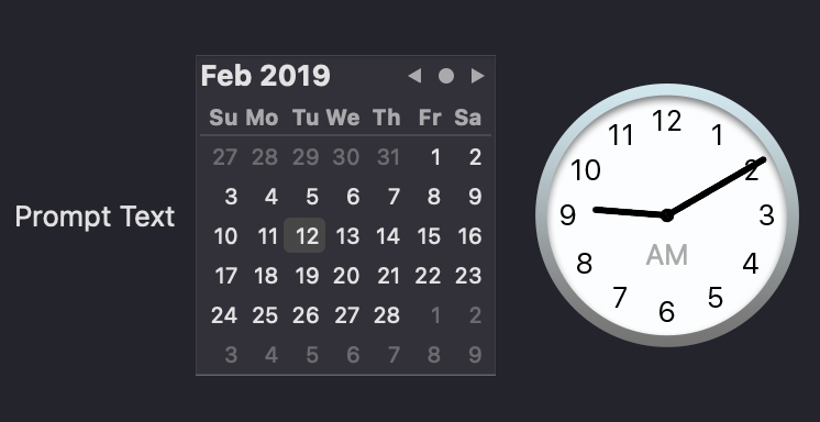
Basic with no formatting options
DatePicker("Prompt Text", selection: $selectedDate)
iOS
The default presentation for iOS on iOS14+ is the Compact style.

When either the date or time is tapped, a GraphicalDatePickerStyle component is launched as a subview.
macOS
The default presentation for macOS is the StepperFieldDatePickerStyle
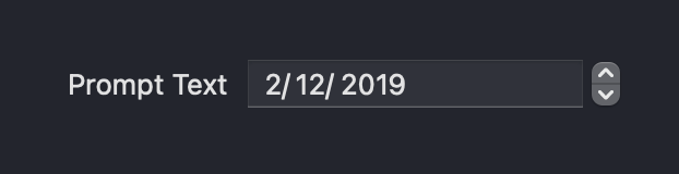
Date Only
DatePicker("Prompt Text",
    selection: $selectedDate, displayedComponents: .date)
iOS

macOS
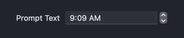
Hour and Minute
DatePicker("Prompt Text", selection: $selectedDate,
                        displayedComponents: .hourAndMinute)
iOS

macOS
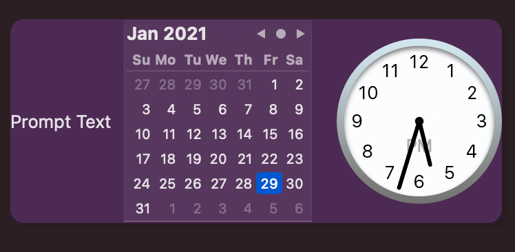
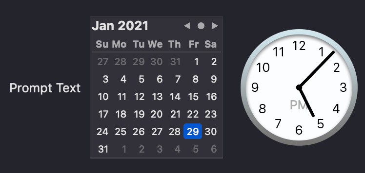
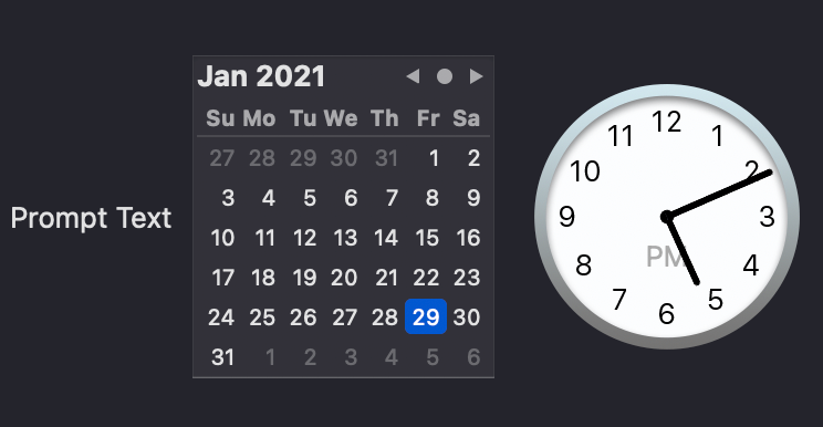
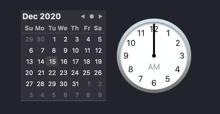
Graphical Style
    DatePicker("Prompt Text",
                selection: $selectedDate)
             .datePickerStyle(GraphicalDatePickerStyle())
iOS
macOS
Wheel Style
    DatePicker("Prompt Text",
                   selection: $selectedDate)
                 .datePickerStyle(WheelDatePickerStyle())
                 .labelsHidden()
iOS
macOS
Not available.
Wheel with Time Only
    DatePicker("Prompt Text",
          selection: $selectedDate,
          displayedComponents: .hourAndMinute)
       .datePickerStyle(WheelDatePickerStyle())
       .labelsHidden()
iOS
macOS
Not available.
Wheel with Label
Note the label will be displayed unless supressed with labelsHidden()
    DatePicker("Prompt Text",
                 selection: $selectedDate,
                 displayedComponents: .hourAndMinute)
       .datePickerStyle(WheelDatePickerStyle())
iOS

macOS
Not available.
Wheel with Border
    DatePicker("Prompt Text", selection: $selectedDate)
                 .datePickerStyle(WheelDatePickerStyle())
                 .background(
                    RoundedRectangle(cornerRadius: 30)
                    .stroke(Color.purple, lineWidth: 3)
                 )
                 .foregroundColor(Color.purple)
                 .labelsHidden()
iOS
macOS
Not available.
Custom Colors
    DatePicker("Prompt Text", selection: $selectedDate)
            .accentColor(.purple)
            .background(RoundedRectangle(cornerRadius: 10)
            .fill(Color.purple)
            .opacity(0.2))
            .datePickerStyle(GraphicalDatePickerStyle())
iOS
macOS
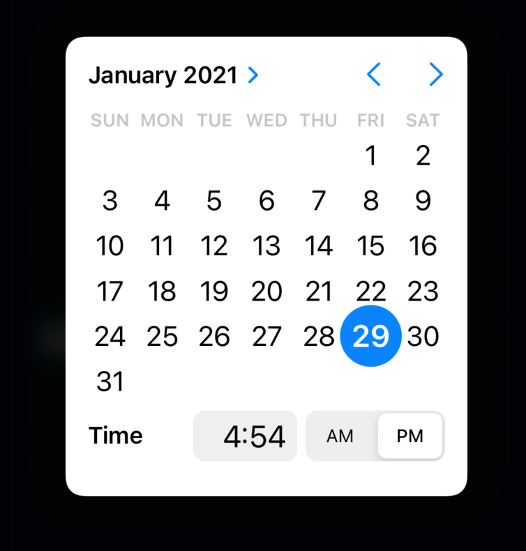
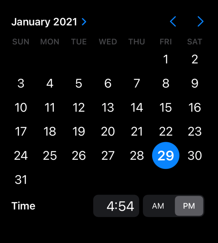
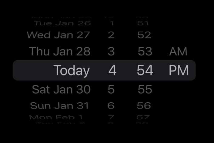
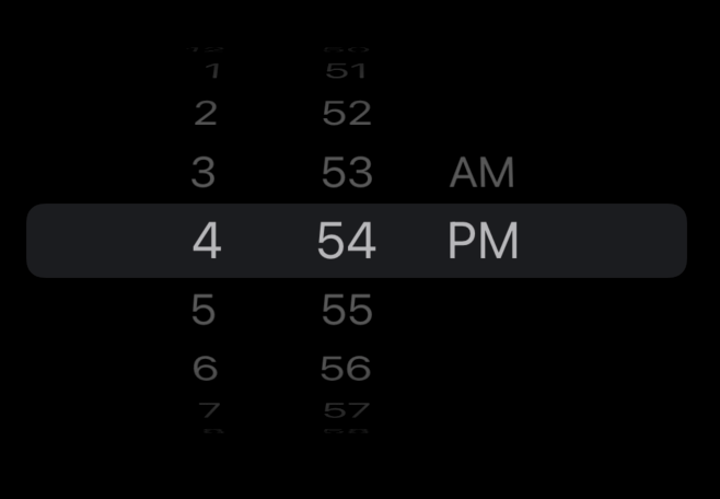
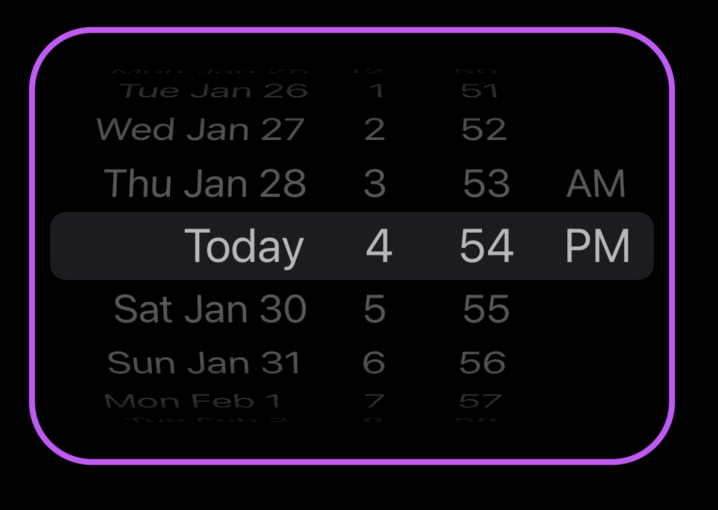
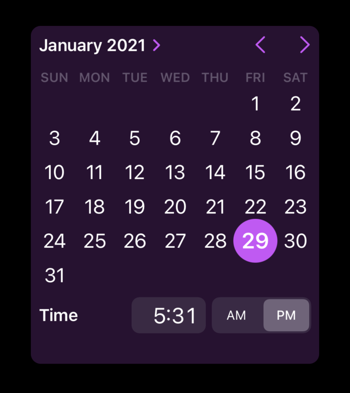
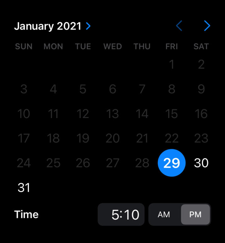
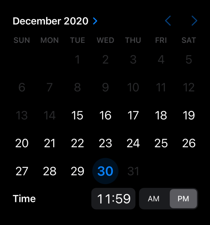
Dates ending with current date/time
Note the date 1/30/21 is grayed out, and unavailable. Any attempt to select a time later than 4:54pm results in the time returning to that time.
    DatePicker("Prompt Text",
                 selection: $selectedDate,
                 in: ...Date())
          .datePickerStyle(GraphicalDatePickerStyle())
iOS
Note that iOS omits the prompt text on GraphicalDatePickerStyle, even though it's not supressed in code.
macOS
On macOS, the time is changed by dragging the hour/minute hands with the mouse. The hands canot be dragged into the future.
1/30 cannot be selected, but it's not visually clear that it's not allowed (as it is on iOS).
Note macOS shows the prompt text (iOS does not).
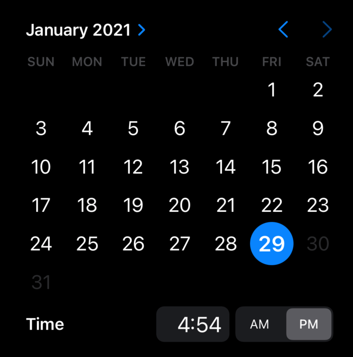
Current Date and Future Only
    DatePicker("Prompt Text",
               selection: $selectedDate, in: Date()...)
           .datePickerStyle(GraphicalDatePickerStyle())
iOS
iOS makes it pretty clear what dates are open for selection.
macOS
It's not very clear that dates before 1/29 are un-selectable, but they dont' respond to mouse clicks.
Closed Date Range
    // pickerDateRange is defined as a view property
    var pickerDateRange : ClosedRange<Date> {
       let calendar = Calendar.current
       let startComponents = DateComponents(year: 2020, month: 12, day: 15)
       let endComponents = DateComponents(year: 2020, month: 12, day: 30,
                                          hour: 23, minute: 59, second: 59)
       return
    calendar.date(from:startComponents)!...calendar.date(from:endComponents)!
    }


    // UI Code
    DatePicker("Prompt Text",
                  selection: $selectedDate, in: pickerDateRange)
              .datePickerStyle(GraphicalDatePickerStyle())
              .labelsHidden()
iOS
macOS
As with the two open ranges, the closed range works as expectded, but it's not visually obvious to the user which dates are selectable.
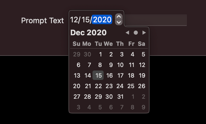
Field
    DatePicker("Prompt Text",
                 selection: $selectedDate, displayedComponents: .date)
               .datePickerStyle(FieldDatePickerStyle())
iOS
Not available.
macOS
This style displays the date as a text field, but when clicked pops-up a GraphicalStyle subview.

Source Code
Source code for the projects used abover are available in my GitHub account: